
The effectiveness of an Internet investigation depends on the ability to collect pieces of information about people or groups, and then combine all the data.

Bellingcat is relaunching its monthly Open Source Challenge, which began in March 2025. The first set of challenges focuses on multispectral image analysis, an important tool in environmental research.

Late last year, Bellingcat launched a series of online challenges to test the skills of open source researchers. The main goal was to make them both informative, ethical and, most importantly, exciting. The idea worked – more than 35,000 people took part. Some even created blogs with analysis of the tasks, and famous GeoGuessr player Reinbolt posted a video of himself trying to complete five tasks in half an hour.
Due to the great interest, Bellingcat decided to make these challenges monthly. The first of them is already available, and each week at the beginning of the month, one new task will appear – five in total. The topics are diverse: geolocation, chronolocation, ship tracking, satellite image analysis, photo verification and flight tracking. The emphasis is on the practical use of OSINT methods.
A new Bellingcat Challenge newsletter is also being launched, which will announce new challenges, publish answers, and highlight the most original approaches from participants. You can subscribe to the newsletter on the official website.
A Discord server is available for knowledge exchange and support, where both the Bellingcat team and participants share their experiences.

Bellingcat’s December challenges included geotagging and chronotagging, and this month’s focus has shifted to multispectral imagery. This is a special type of satellite imagery that allows you to see what is invisible to the human eye. It can be used to determine the presence of water, analyze vegetation types, and study soil conditions—these are tools that are increasingly being used in open-source environmental research.
For those who are not yet familiar with this method, Bellingcat has prepared a separate guide explaining how multispectral imagery works and how to analyze it. This guide will be a useful starting point before completing the new challenge.
For those who are not yet familiar with this method, Bellingcat has prepared a separate guide explaining how multispectral imagery works and how to analyze it. We will now explain it in more detail.
When we view satellite imagery on platforms like Google Earth, it mostly shows the world as we see it with the naked eye—like the view from the window of an airplane.
However, satellites can capture much more than human vision can perceive. One example is night vision, which uses infrared radiation to “illuminate” objects in the dark. In satellite imagery, this approach is implemented through multispectral imaging—imaging in different ranges of light, including beyond the visible spectrum.
Multispectral imaging can reveal valuable information about the environment—including the state of water bodies, vegetation types and health, soil characteristics, and more. In this article, we’ll take a closer look at how such imaging works, show its practical application for monitoring deforestation and mining activities, and introduce open tools for self-analysis of satellite data.
When we look at an object, we are actually seeing different colors of light reflected by that object. When we look at plants, they appear green because the chlorophyll in their leaves absorbs blue and red light and reflects green light. In the fall, leaves turn orange because the chlorophyll starts to break down to conserve energy, and it also starts to reflect red light.

An image that reflects how the human eye naturally sees things is called a “true color image,” which consists of three bands (or ranges) of visible light—red, green, and blue—that can combine to produce any color. If an object reflects all visible light, we see it as white. Conversely, if it absorbs all visible light, it appears black.
See how this works by turning the red, green, and blue channels on and off in the image below:

Multispectral images can be useful in research because they can highlight changes to the Earth’s surface that are not visible to the naked eye, whether due to mining, deforestation, or pollution. These images often use bands of light from the infrared part of the light spectrum, in addition to those normally visible to the human eye.

We can look for signs of different activity by comparing different bands of light (visible and invisible), highlighting contrasts that we would not normally be able to see.
In the example below, the river is barely visible in the digital image on the left, due to the foggy conditions. But it is clearly visible in the infrared image on the right. This is because the longer wavelengths of the infrared part of the spectrum are less likely to be scattered by small particles, such as water droplets in fog or dust particles, than visible light.

Another common use case for infrared light is in the illumination of vegetation, as healthy trees and plants reflect a lot of infrared light compared to other materials.
Since we can’t normally see infrared light, we have to compare the light from these bands with the visible bands – red, green and blue – to detect different types of materials. There are three main ways to do this, which we’ll cover in this guide.
Just as visible light can be divided into red, green, and blue bands, the infrared light that satellites can capture can also be broken down into separate bands, each representing a range of wavelengths useful for analysis. Commonly studied infrared bands include near-infrared (NIR), short-wave infrared (SWIR 1 and SWIR 2), and thermal infrared (TIR).
The easiest way to visualize these invisible bands of light is to directly map them to a visible color channel (red, green, or blue) to create a “false color” image. This mapping can highlight differences between materials that might look very similar in visible light, or, as in the example above, allow us to see more clearly in adverse conditions.
There are several free, open source satellite imagery tools that include features that allow users to create simulated color composite images using different channel combinations, such as EO Browser, Google Earth Engine, and QGIS. To demonstrate the techniques used in this article, we also created a tool called Multispectral Imagery Explorer that uses Google Earth Engine to show what simulated color images can look like using multiple channel combinations, channel ratios, and channel indices (which will be discussed later in this guide).
The case study below uses images from the Multispectral Imagery Explorer to demonstrate how combinations of bands can highlight certain materials.
Kaolin clay (also known as kaolinite) is a naturally occurring mineral used in many industries, including paper and ceramics. As with any mining operation, the extraction of this material can have environmental impacts, such as habitat destruction and the contamination of nearby water bodies with mining waste.
Satellite imagery analysis can help researchers monitor areas with high kaolin clay deposits where mining activities may occur.
The satellite image below shows the mines and lakes rich in kaolin clay in Sandersville, Georgia, USA, known as the “Kaolin Capital of the World.” Over 8 million metric tons of kaolin clay, worth approximately $1 billion, are mined each year from large open pit mines in the state of Georgia.

In this image, the lakes are visible as green patches, but it is difficult to tell exactly where to look for mining operations. Although kaolinite is white, it is indistinguishable from other white materials in a true-color image because they often have similar visible light reflectance properties.
To help us distinguish the differences in these areas, we will look at the reflectance spectrum of kaolinite, which shows how the material reflects light in both the visible and infrared wavelength ranges.
We compare these to the reflectance spectra of eight different bands of light obtained by Landsat 8, a satellite launched by NASA in 2013 that is still in orbit and collecting one of the world’s oldest sets of satellite imagery. Although multispectral images from other satellites, such as Landsat 9 and Landsat 7 (which ceased operations earlier this year), record data on similar bands of light, we will use the Landsat 8 bands for all examples in this article.
The black line below represents the reflectance spectrum of kaolinite, and the vertical bars show the wavelengths of the Landsat 8 bands.

To help us identify possible kaolin clay, we can use the bands in which the material reflects a lot of light, along with those in which it mostly absorbs light, to create an artificial color composite. The different bands map to the visible colors in our artificial color image as follows:
SWIR 2-band (7) → Red
SWIR 1-band (6) → Green
Red band (4) → Blue
This means that if the material shown in the image reflects a lot of light in the SWIR 2 band, it will appear as red pixels in the false color image, light in the SWIR 1 band will appear as green pixels, and light in the red band will appear as blue pixels.
Since kaolinite reflects more light in bands 4 and 6, and less light in band 7, areas with a concentration of kaolin clay should appear blue, which is a combination of the colors they are overlaid on – green and blue respectively. Compared to the RGB image above, you can now see much clearer demarcations between parts of the image that appear mixed together above to identify possible kaolinite deposits, although this still needs to be confirmed from other sources, as other materials may have similar reflectance properties.

Band combinations are useful if the material we are looking for can be observed by comparing up to three bands (one band per color channel). However, they may not be as accurate as we would like, as band combinations can be affected by changes in shadow and light, atmospheric conditions such as haze, or materials with overlapping reflectance properties—an area that appears blue may actually reflect an area that contains materials that reflect a lot of light separately in the blue and green channels, for example. By combining different bands together using a band ratio, we can create even more powerful visualizations to distinguish objects of interest.
Band ratios emphasize the contrast between different bands by dividing the pixel values in one band by the pixel values in another. When determining which ratio to use to highlight a particular material, we are looking for the parts of the light spectrum where the material reflects the most and the least light. By dividing one by another, very specific materials can be precisely identified.
Bauxite is a rock with a high concentration of aluminum minerals that is the source of more than 99 percent of the world’s aluminum production. Growing demand for aluminum has led to a massive expansion of bauxite mining in recent years. Bauxite mining is increasingly spreading to indigenous lands and is associated with deforestation, changes in water sources, and community displacement.
Bauxite is mined through large open pit mines, and a key byproduct of bauxite mining is “red mud,” a polluting slurry that is typically stored in large toxic “tailings” near processing plants. Because of the impact of these mines on local populations and their rapidly changing relationship with the global economy, tracking these mines can provide important insights into the political ecology of the region.
Aluminum in bauxite is difficult to identify directly, but we can look for signs of other minerals that make up bauxite and red mud: iron oxides (found in minerals such as goethite and hematite) and kaolinite. Comparing the ratio of the zones of the three parts can help determine the presence of these different minerals.
In this example, ferric oxides should appear yellow (a mixture of red and green), kaolinite clay should appear blue, and areas where both kaolinite clay and ferric oxides are present should appear white.
Iron(III) oxide ratio 1 (4/2) → Red
Iron(III) oxide ratio 2 (4/3) → Green
Clay band ratio (including kaolinite) (6/7) → Blue
If we compare the RGB image of the region with an image showing a ternary combination of iron(III) oxides and kaolinite, we can see much more clearly the areas with potential bauxite mines, highlighted in bright yellow. We can also see yellow spots where the river meets the sea, indicating possible traces of water pollution from these mines.
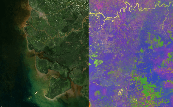
We can also compare multiple false-color images taken over time to visualize the impact of policy changes on the region.
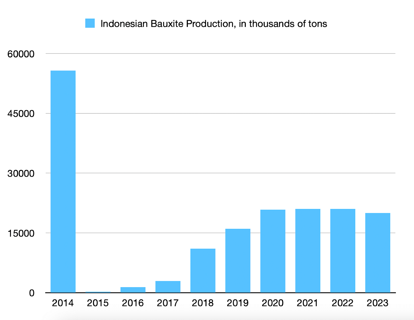
If we take a timelapse of the area around the Kapuas River (the area in the image above with the concentration of yellow areas) between 2013 and 2024, we see that there was almost no expansion of the yellow spots indicating possible bauxite mines between 2014 and 2018. This coincides with the Indonesian government’s ban on certain raw materials, including bauxite, in 2014. However, the yellow spots have continued to expand again since 2018, after the Indonesian government eased its ban on bauxite exports in 2017.

This timelapse shows the U.S. Geological Survey’s aggregated data on bauxite production in Indonesia over this period: a significant drop after the export ban in 2014, followed by an increase since 2018.
An extension of the band ratio idea used above is the satellite image index. These indices are more complex combinations of different bands and are widely used to track specific phenomena such as vegetation changes, water availability and quality, soil condition, and tree cover.
The index database by Verena Heinricht and Htarina Bruser is a useful resource for finding indices related to different materials. The EO Sentinel Hub browser also allows users to use satellite image indices and their own scripts to create false-color images that highlight specific materials or phenomena, such as algae and forest fires.
The following case study shows how the Normalized Difference Vegetation Index (NDVI), a popular index for detecting the presence of healthy vegetation, was used to investigate the impact of the Yemeni civil war on food security in the agricultural Tihama region of the country.
In a 2020 analysis for Bellingcat, researcher Wim Zweinenburg used EO Browser – based primarily on satellite imagery collected by the European Space Agency’s Copernicus program – along with NDVI to visualize vegetation loss in areas known for date palm plantations.

The analysis showed that most of the vegetation loss occurred in the area near the sea. This provided a starting point for focusing attention and, using other open-source tools and remote sensing, allowed us to track vegetation changes over this period and explain why the conflict led to tree cover loss.
As the case studies above show, multispectral satellite imagery provides a wide and diverse range of information about the Earth’s surface, including much that is invisible to the naked eye.
These satellite images provide open-source researchers with a set of capabilities that allow us to see the landscape differently, highlighting changes to the surface such as mine expansion, the spread of pollutants, and changes in vegetation. By highlighting subtle differences in how materials reflect different types of light, we can draw some very complex conclusions about the ecological and geological properties of the landscape.
However, it is also important to understand some of the limitations of multispectral satellite imagery to avoid misinterpretation. Here are some tips on what to look out for.
Clouds can be especially deceptive when using false-color images, as they often look different from the natural landscape and can be difficult to distinguish from other materials of interest.
Switch to true-color images to make sure what you’re seeing is interesting and not just a cloud.

Features of interest (e.g., minerals associated with mining) can be obscured by vegetation and other cover. Areas covered by tree canopy cover are particularly prone to this. Additionally, many minerals are mined underground rather than on the surface, making satellite imaging tools unsuitable for this analysis.
Consider these images of a bauxite mine in Kuantan, Malaysia, taken with the Multispectral Imagery Explorer, before and after the land in the area was covered with fertile soil following the Kuantan bauxite mine disaster of 2015-16. The first image, from 2015, shows the mine clearly, while the second image of the same area from 2023 shows the mine now hidden.

After all, it can be tempting to jump to conclusions about the significance of various features in a false-color image. But in practice, geologists use a variety of more sophisticated methods, along with contextual studies of the area, to make inferences about the mineral composition of an area. There are many materials that will look similar in false-color images, so it is important to check information from other sources before making conclusions.
For the clay and bauxite mining case studies in this guide, we compared the false-color images to the U.S. Geological Survey’s Mineral Resources Map, which shows government-issued mineral licenses around the world. We also referenced a detailed interactive map of mining concessions in the region, issued by the Indonesian government, to support our observations in the West Kalimantan bauxite mining case study.

Multispectral satellite imagery allows us to see what is invisible to the naked eye—changes in vegetation, soil, water, and traces of mineral extraction. Combinations of bands, ratios, and indices help to accurately detect these phenomena. But interpreting such data requires caution and verification from other sources.

